If I had to choose only one ink, which would I choose? It would be VersaMark!
VersaMark is a versatile ink for all types of stamping projects. You can create a watermark, emboss with powders, create shadows, resist effects or develop your own techniques. In this blog post, I will review this incredible ink and talk about why I enjoy it so much.

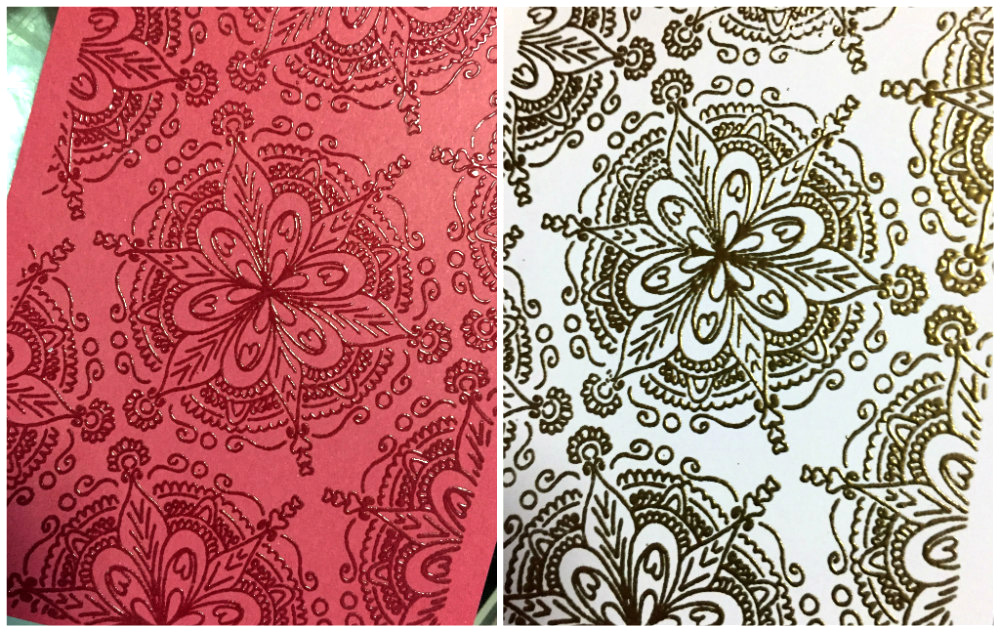
Stamping VersaMark on light or dark colored cardstock creates awesome results. The paper color is darkened a step or to wherever you stamp the ink. If you use light cardstock the ink effect is a little shiny, but if you use it on dark cardstock the effect is very vivid. This is also known as tone-on-tone technique and will create subtle and beautiful results. In the sample above, you can see how VersaMark shows on a true red cardstock which I use in card making all the time. This image is not embossed, it is just VersaMark ink stamped onto the cardstock.
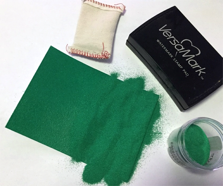
If you want to enhance the tone-on-tone effect, you can always sprinkle clear embossing powder before the ink dries and heat set. VersaMark's tacky thickness makes it the number one ink for use with embossing powders. This is commonly done with white cardstock. Stamp the image with VersaMark (it will be harder to see on white paper), and then pour colored embossing powder over and it will stick perfectly to the VersaMark ink. If you chose a metallic embossing powder color, like gold, it will really pop off the page once heat set. I recommend investing in a few different embossing powders—clear, gold, silver and black at minimum.
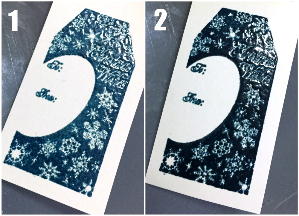
If you only have clear embossing powder, you can still use VersaMark to create colored embossed areas! By pairing VersaMark and clear embossing powder with any dye ink, you can obtain unique colored embossed images. The method I used for the first Christmas Snowflake tag above could be done with any stamp. I simply inked the stamp with VersaMark first and, without stamping, inked again with the blue dye ink, and then stamped on the cardstock, added the clear embossing powder, and heat set. For the method in the second photo, you would need a stamp positioning tool like a Misti. I stamped with the blue dye ink then cleaned the stamp and stamped again with VersaMark, added clear embossing powder and heat set it. Playing with embossing powder and layered stamping with color dye inks is fun and produces a variety of results as you can see in the tone difference in these two Christmas tags that were created with the same two inks.
When you emboss VersaMark it is perfect for resist techniques. The process for emboss resist is very simple, just stamp your image with VersaMark, cover it with clear embossing powder and set the powder with the heat tool. Then apply the colored inks with a sponge dauber or brayer and when you are satisfied with the color, use a paper towel to remove the ink that is lying atop the embossed areas to see the resist effect.
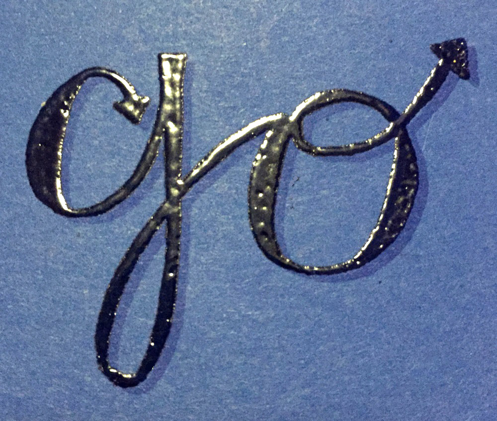
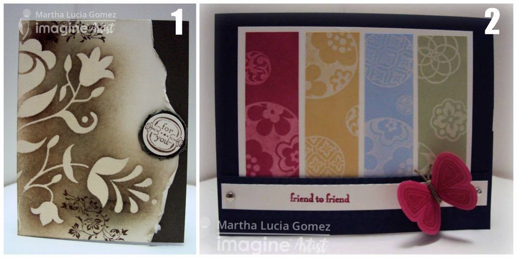
Another thing I love to create with VersaMark is shadows. In the sample above, I stamped the "go" image with VersaMark and embossed with gold Embossing powder. Then I used VersaMarker to draw a shadow of the word "go". The tone-on-tone effect creates a perfect shadow look! You can also do this on white cardstock and with any color ink. Simply stamp your image with the color ink pad, and then stamp it a second time with VersaMark only a little bit offset, then add embossing powder to obtain the desired effect.